A more accessible proof using tools seen in applied statistics, ML, or computer science courses.
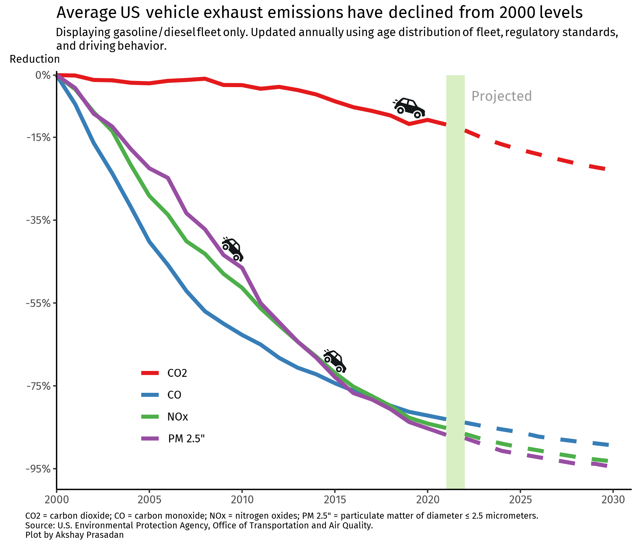
Progress or stagnation in average vehicle emissions in the US.
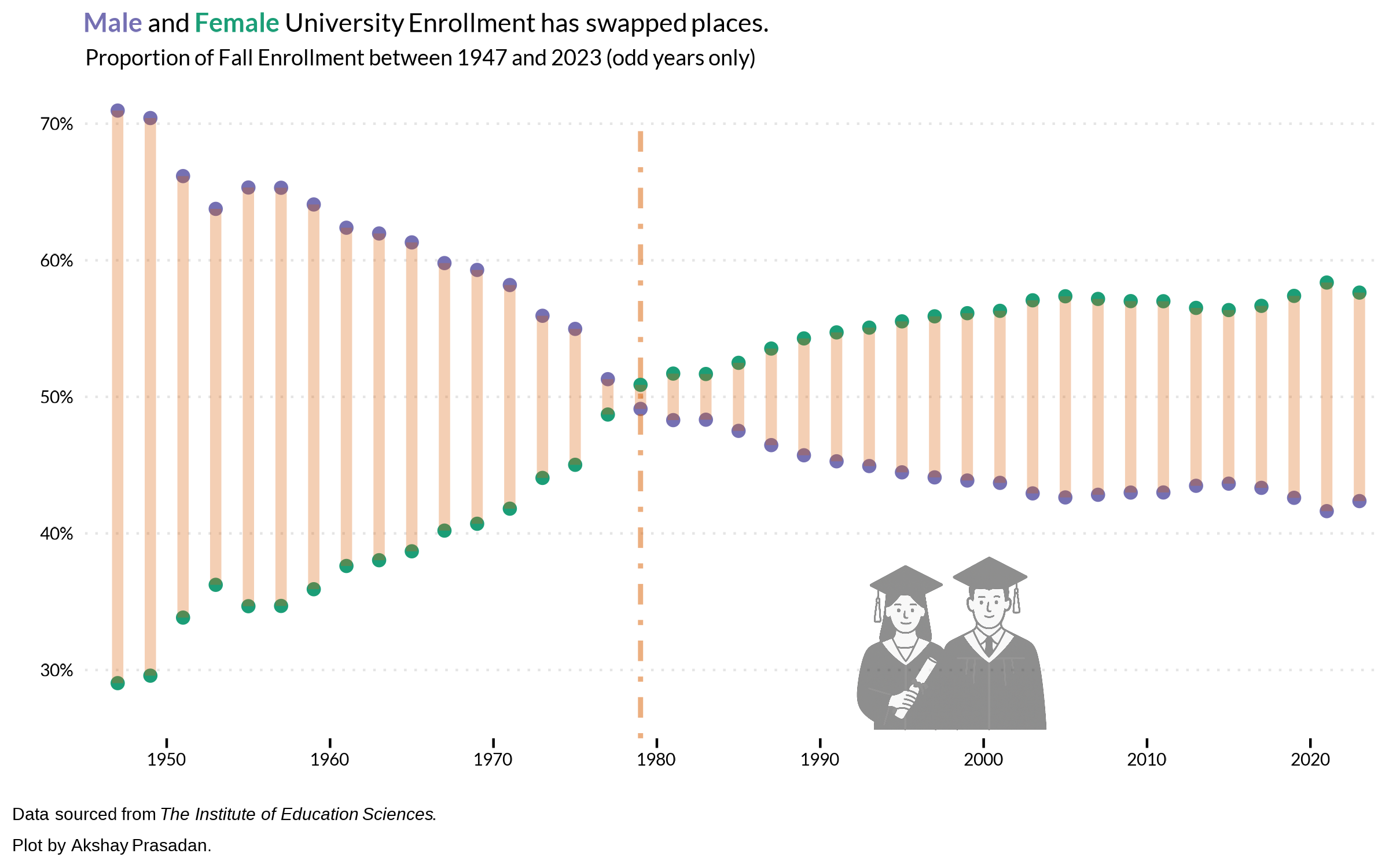
The bells and whistles of a dumbbell plot on trends in university enrollment.
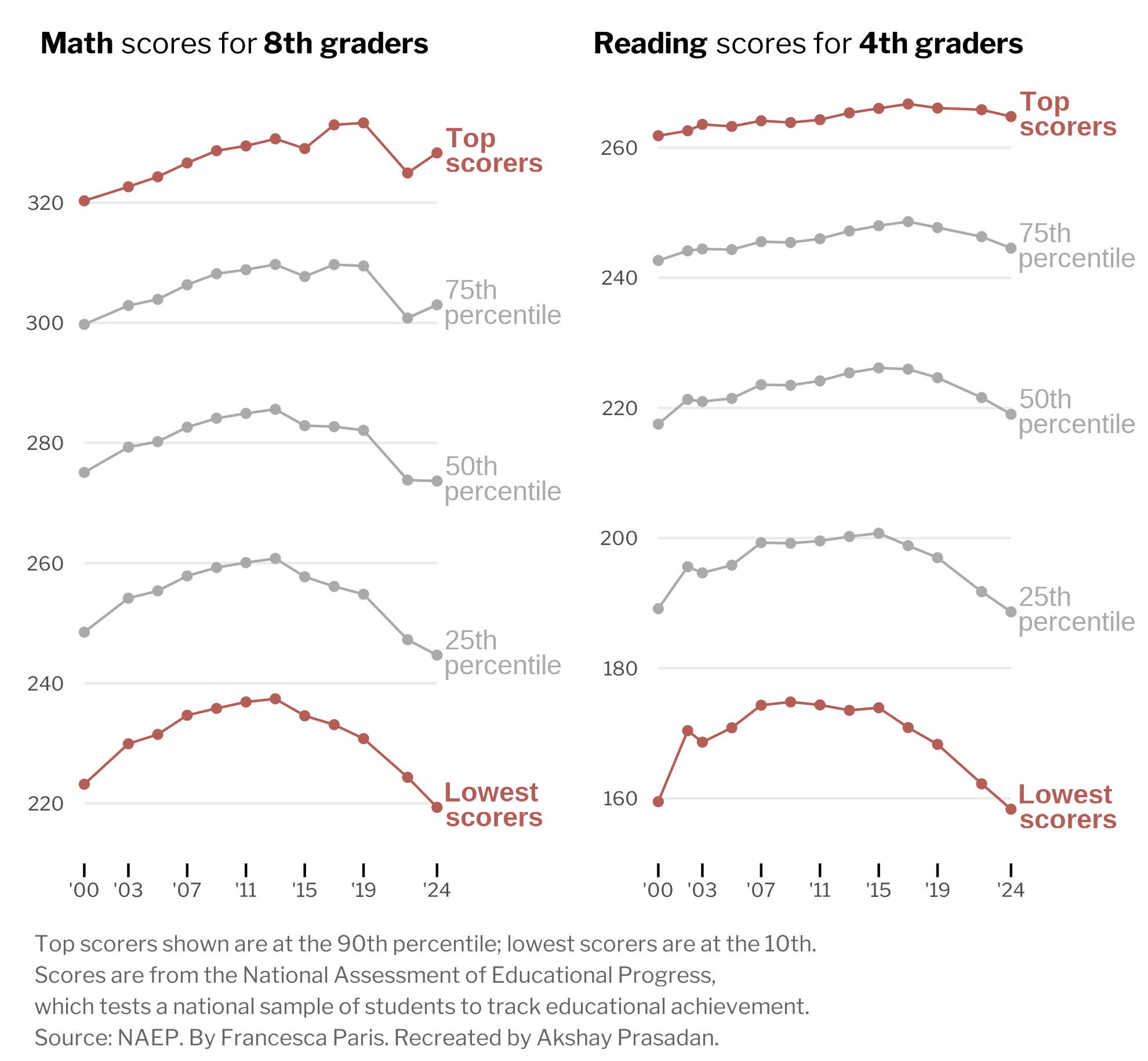
Learn from the best by replicating a New York Times graphic on America’s educational decline.
Modern data science libraries make professional presentation effortless. Let’s tackle my biggest pet peeves.